The Zen Educate website has experienced a significant challenge in achieving a high organic sign-up rate due to poor visibility in Google search results. The existing website structure lacks optimisation for search engines, resulting in diminished organic traffic and missed conversion opportunities.
Client
Zen Educate
Category
UX/UI Design, SEO
The Zen Educate website has experienced a significant challenge in achieving a high organic sign-up rate due to poor visibility in Google search results. The existing website structure lacks optimisation for search engines, resulting in diminished organic traffic and missed conversion opportunities.
Hypotheses
Through the successful implementation of navigation optimisation, we anticipate achieving the following outcomes:
Increased organic sign-up rate due to improved visibility and higher rankings in Google search results.
Enhanced user experience through a streamlined and intuitive navigation system, leading to increased user engagement and conversions.
Improved site structure and relationships between pages, enabling users to navigate the Zen Educate website more effectively.
A balanced approach that effectively addresses SEO requirements without compromising the overall user experience.
Let's Get Started...
What problem are we facing?
Where We’re Starting…
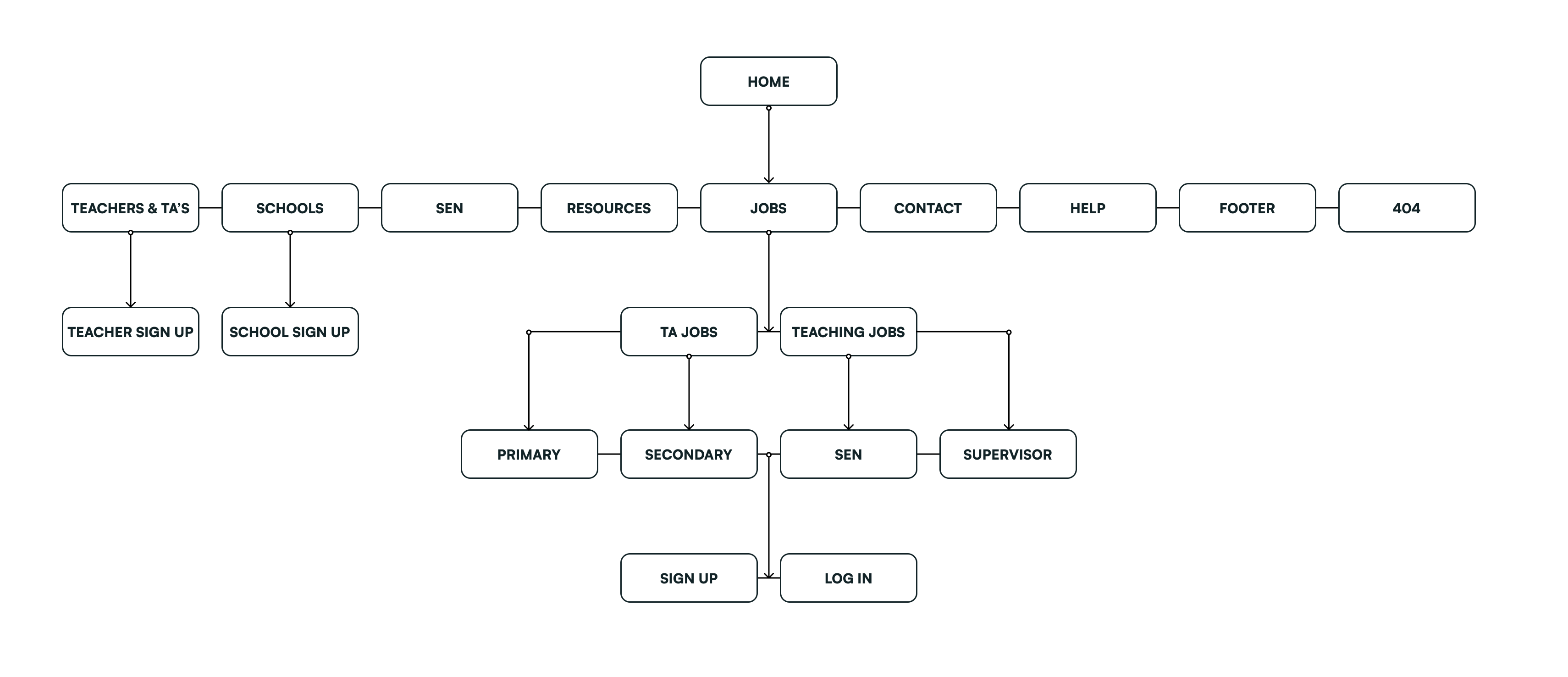
I started by creating a site map as a visual overview of the website’s content - focusing on our current “Jobs” section which highlights all teaching assistant and teaching jobs recently posted on the platform.
The Problem?
UX Problems
Hundreds of recently-posted jobs were being fetched from the database when a user navigates to the jobs tab.
These jobs were not filtered by region or job specifications, meaning users would have to manually dig out work they might be interested in.
This would also result in long loading times, peaking at 18 seconds!
SEO Problems
Google search prioritises pages that have relative relationships to one another.
The hierarchy of the site navigation was flat, and pages weren’t related or filtered by content- resulting in poor search optimisation for the Zen Educate website.
In short, if a user searches by “Primary teaching jobs in London” Zen Educate wouldn’t have a unique URL to take the user to, resulting in poor search optimisation.
Defining the problem...
What do our users need?
SEO Audit and Proposed Solution
Starting off with an SEO audit conducted by myself and Matt Johnson at Responsive Media, we uncovered an optimal hierarchy- which started off with a revamp to the navigation of the website.
Our Brand New Navigation
The new hierarchy would start with creating separate hub pages, with unique URL’s, surfacing jobs by region and borough. This would mean that if a user searches for “teaching jobs in Hackney”, or even “teaching jobs near me” Zen Educate will shoot up right to the top!
The Problem?
Conducting 3 rounds of user interviews and internal analysis on the new proposed nav bar, all participants expressed a feeling of “information overload” looking at this new navigation.
Quotes from our participants:
"Why can’t I just search on the website for the job I want?"
"This doesn’t really work for me, just because I live in Islington doesn’t mean that I’ll only be looking [to work] in Islington. In London, it’s so easy to hop on the tube. I’d be open to working in different boroughs you know?"
"I still don’t really know where to go? I’m looking for an EYFS teaching job but I can’t see the option of that anywhere on the website. It’s a bit frustrating."
Moral of the story…
SEO is vitally important for targeting and acquiring new users to the platform, but the user experience mustn’t become secondary. If our users are confused and agitated by these designs, it’ll only result in drop-off. Therefore, it was crucial we find a new solution, a middle ground, which marries both SEO requirements and a good user experience to generate adequate results.
Summarising User Feedback
After conducting user feedback calls with teachers working with Zen Educate, we uncovered three insights which became imperative to creating a top-notch experience:
All participants raised viewing jobs by borough seemed unnecessary and wasn’t useful for achieving their goal
"[As a teacher based in Manchester] I drive to work, so travel distance does matter, of course, but I’d be willing to look at jobs that are a bit further out so I could see more."
"I’m moving in a few months so I’d like to see work that’s near me now, but will also be relatively close to where I’ll be moving to at the same time."
Participants felt upset when seeing jobs they weren’t interested in, and didn’t match their work preferences.
"I expected more options, so I can see what I’m really interested in. Nursery cover, for example, I’m just not interested in so I don’t wanna see all that."
"I don’t really feel satisfied after seeing this. I’m looking for a long-term position I’m going to love and I’d like to see more information about that job."
I’m actually really new to teaching, and I’m seeing all this work for teachers with a QTS but I just don’t have that. So it’s making me feel a bit sad, I don’t know.
Users stated their biggest motivator to sign up to Zen Educate would be seeing jobs matching what they’re looking for.
I saw so many Zen Educate jobs on LinkedIn that sounded really promising so if you could show the same jobs on the website that would really motivate me to sign up.
I actually wasn’t looking at agency work, but I saw this job on Indeed which was at a school near me, and the salary didn’t look bad too. So when I applied to Zen, this was what I had in mind. The job was gone by the time I signed up, but I managed to find [a daily supply role] a couple months later at the same school so I was over the moon.
Building the designs...
Bringing our ideas to life
Acting On User Feedback
From the insights collected above, our users need a more specific search tool, which collects and leverages jobs based on their job interests and experience. These users also found the current system of viewing jobs by borough unnecessary and unhelpful in achieving their goal.
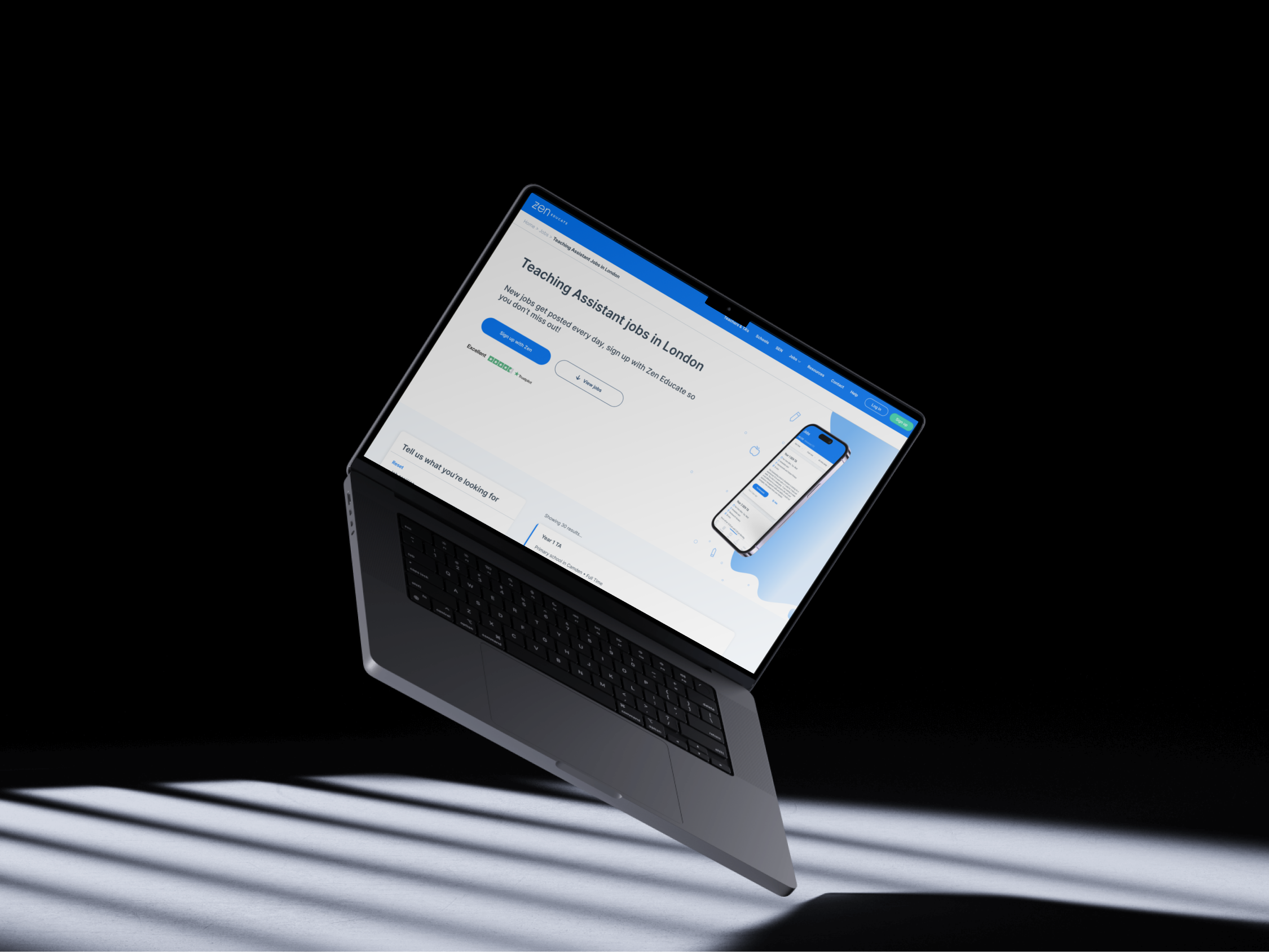
Therefore, our proposed solution was to allow users to navigate to a jobs page based on job type and region. Users can then dynamically alter their search with a handful of filters to see more specific jobs.
In terms of SEO, the website can greatly improve its search rankings by generating individual URLs for each hub page, such as "Teaching Assistant jobs in London," and for any additional filters implemented, such as primary and secondary categories or specific boroughs. This approach will contribute to higher search visibility and improved search results for the website.
Step 1: Preventing “Information Overload”
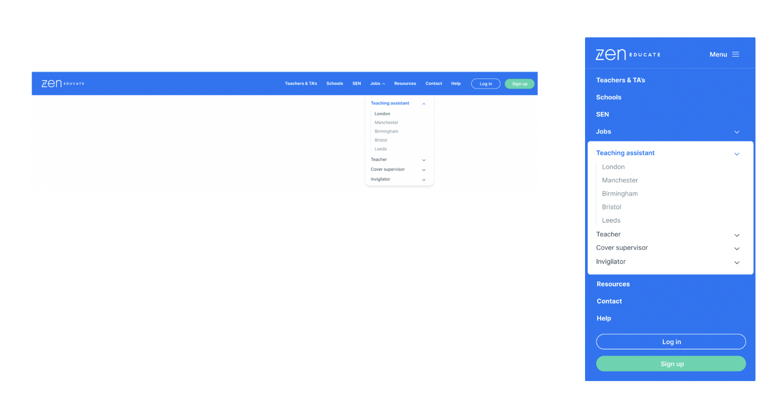
The first design solution bombarded users with “information overload”, resulting in frustration and confusion about where to go next.
So we started by shortening the nav, hiding extra information behind a dropdown for users that dared to venture further.
Step 2: Filters Make Everyone Happy
We understand that nobody wants to spend countless hours scrolling through numerous job listings to find the right opportunity. That's why we wanted to give our users the option to customise their job searches with advanced filtering options.
By incorporating these filters, we not only improve the user experience but also boost our website's SEO. Each filter added creates a unique URL, making it easier for job seekers to discover relevant positions through Google's search results. It's a win-win situation that enhances usability while increasing visibility for our users.
Step 3: Creating The Perfect “Hub Page”
A hub page is a centralised home for related content and resources. It improves SEO by attracting search engine traffic and guiding users to specific pages within the website.
So, how did we create the perfect hub page?
Things to take notice of:
Boosting User Engagement: By holding a “Sign Up” CTA above the fold, as well as filter interactions below, we’re guiding users to explore further and interact with the page- boosting overall website engagement.
Relevance: One clear piece of user feedback was that jobs shown should be relevant to their needs. By incorporating a filter asset, the website is now populated with meta tags and relevant keywords to help users land on the page that addresses their search needs best!
Breadcrumbs: With added hierarchy to the website, I had concerns that our users may get lost and unsure how to return to a previous page. But fear no more, we’ve added breadcrumbs as additional navigation so users will always feel well-guided on their journey to finding the perfect job.
Regular updates: As part of this project, a talented team of developers moved the entire marketing website to a new CRM system. This ensures, future content updates are easier to implement, helping these hub pages maintain relevance and usefulness.
Step 4: Individual Job Pages
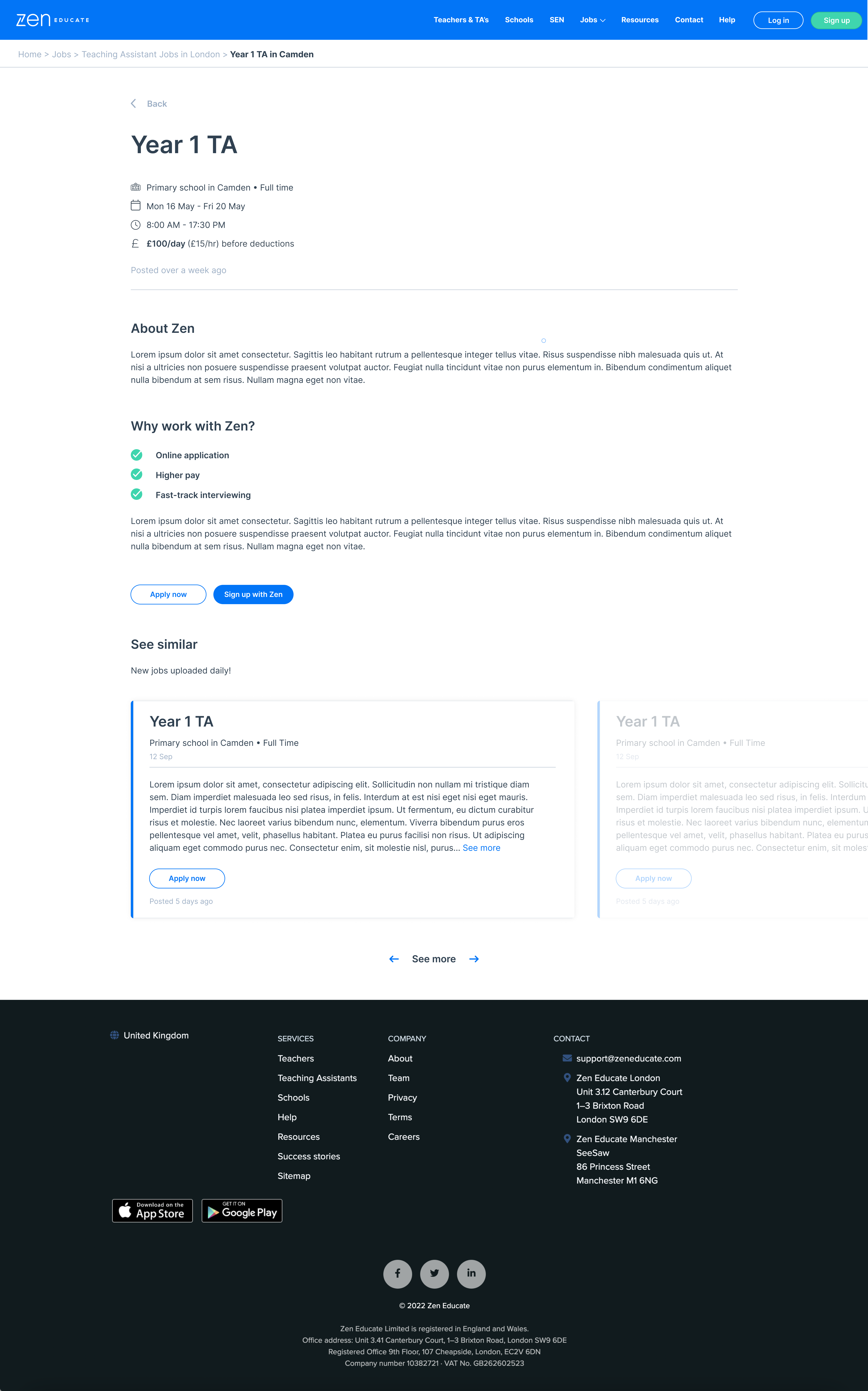
Because we like to go above and beyond, we decided to build out our jobs cards into individual pages, as suggested by our SEO consultant.
Each with unique URL’s, these individual pages further drive SEO through indexing and page optimisation.
Testing our hypothesis...
Are we moving in the right direction?
In conclusion...
What we achieved, challenges, and next steps
Monitoring the results
After 6 months of hard work within the candidate experience team at Zen Educate, we put this new marketing website live!
After rolling out the MVP, including new optimised navigation, hub pages and individual job pages, all with unique URL’s, we monitored the data for several months.
After 3 months, we saw an incredible increase in website traffic of over 50%! And the number of organic sign-ups rose from 13% to 46%.