Accessibility-Driven Design Challenge: Redefining Communication in Healthcare

Putting accessibility first in this concept project completed alongside the great minds at Imperial College London
Client
Care Connect
Category
UX/UI Design

Where We’re Starting…

In March 2022, A&E wait times hit a record high of nearly fourteen hours, causing significant concerns, particularly for individuals in small UK communities, the elderly, and those with disabilities who may require immediate medical attention. To ensure the prevention of avoidable deaths and promote equitable access to treatment, it is crucial to implement a solution that facilitates equal accessibility and timely care for all individuals.

‍

The Need & Approach

A product that allows rapid communication between patients, carers and emergency care clinics. The product should be simple enough to be used by people with a diverse range of ages, physical and cognitive abilities in the case of an emergency.

Considering the likelihood of this product being utilised in emergency scenarios, prioritising its accessibility across various situations becomes paramount in the design process. Therefore, adopting the progressive enhancement design strategy is the optimal approach for ensuring its usability and effectiveness across multiple platforms.

‍

Let's Get Started...
What problem are we facing?

2-day User Interview Sprint

I embarked on a 2-day sprint to interview as many people as possible at The Royal London Hospital. The mission? To delve deep into the present challenges and pain points experienced by people with disabilities, and their caregivers, when seeking emergency care.

The Participant Pool
  • 10 User Interviews.
  • 5 participants were individuals in need of care & support with a diverse set of needs.
  • 5 participants were professional or volunteer carers.
  • All participants were over the age of 50*

*This is referenced later in the “Challenged & Constraints” section.

Three Key Findings

  • All participants were unaware of current caregiver apps on the market.
  • From competitors that carer participants stated, there’s currently no easy way for both carers and patients to receive appointment updates.
  • There are currently limited resources for non-professional carers (those that care for loved ones).
  • Patients with motor disabilities have few options for how to contact their carer in an emergency situation.

‍

Analysing the Current Market

I researched both direct and indirect competitor care apps on the market, as well as the emergency SOS features implemented inside the interface of mobile phones and smart watches.

‍

Defining the problem...
What do our users need?

User Profiles

Now, there are tons of users I could design for with this project, but since I had limited time I decided to build my persona’s based on the small user pool I spoke to at The Royal London Hospital.

Margaret’s Journey

Scenario: Margaret has fallen down the stairs in her home and requires immediate care. Her carer is not at home with her.

Building the designs...
Bringing our ideas to life

Designing for different use cases...

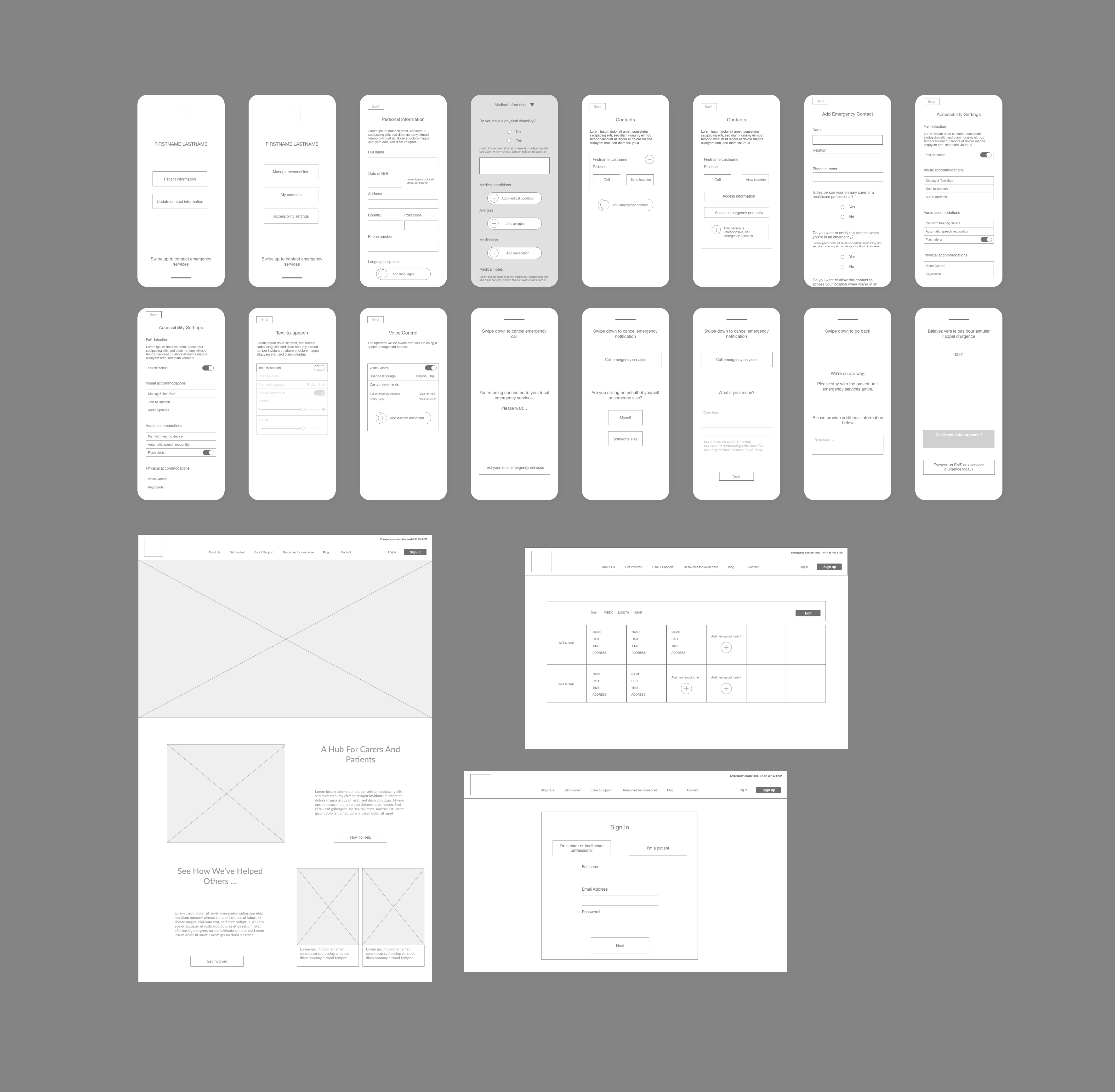
Low-Fidelity Wireframes

Since cluttered UI was a major pain point discovered in the user interviews, it was crucial that the app was easily navigational to aid fast visual communication during an emergency. Due to this, many of the more complex settings derived during early brainstorming were scaled back.

High-Fidelity Mockups

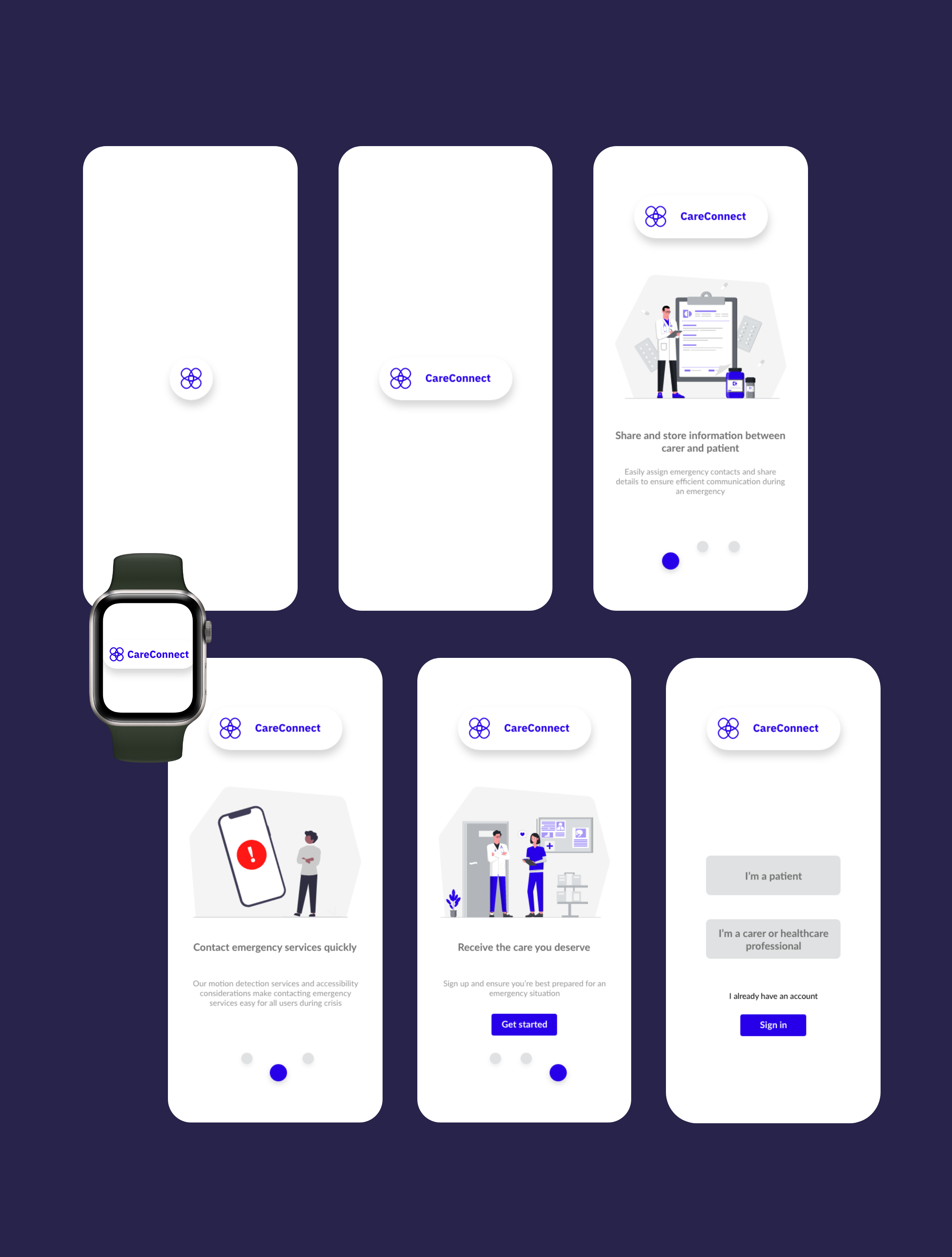
Bringing together all the research, insight findings, and ideation techniques, I was able to start bringing the brand to life by creating high-fidelity mockups of the most important screens.

Personalised Onboarding

I have streamlined and simplified the sign up process, making it faster and easier to get signed up as either a patient or healthcare professional, with a user-friendly approach. One of the key aspects of my solution is the reduction of unnecessary steps, eliminating any superfluous information or redundant verifications, and allowing users to input this data later on.

Multi-platform design

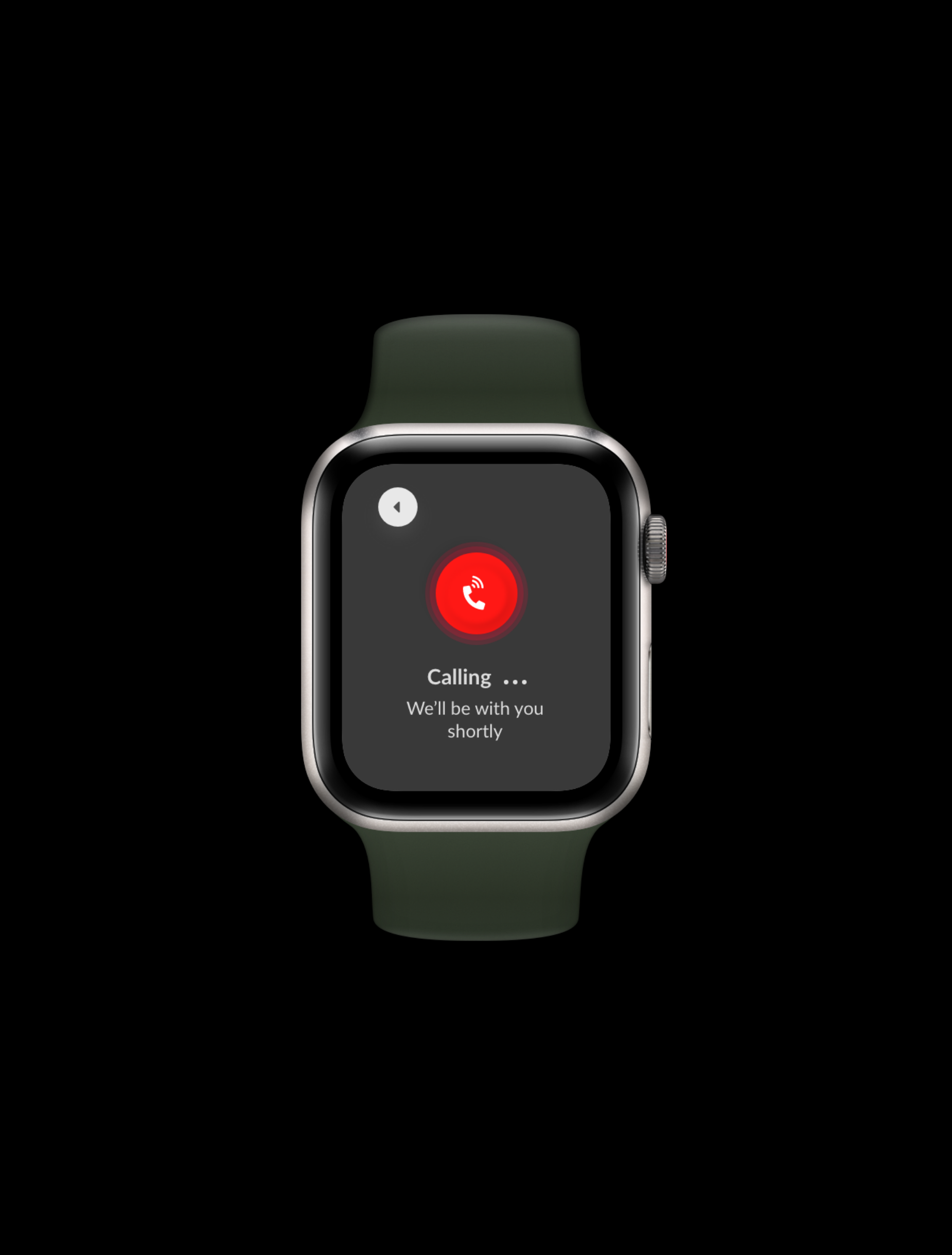
Designing for both smartwatches and mobile devices, equipping users with 24/7 access to emergency care in their pocket. It's important to note that the designs for each platform differ in use cases, and therefore complexity.

Not just a product, we're building a brand

By creating the responsive website to compliment the app, a brand identity was naturally created; CareConnect is a support hub for both carers and patients to streamline communication between the two parties.

‍

Testing our hypothesis...
Are we moving in the right direction?
In conclusion...
What we achieved, challenges, and next steps

Visual Design Constraints

Based on our foundational research, it appears that the user pool exhibits limited confidence in using technology, particularly those with cognitive disabilities, which can hinder their ability to effectively engage with the technology. Therefore, it became imperative to present information in the simplest and most universally understandable manner possible.

Age Bias In Foundational Research

Although user interview participants were from a range of backgrounds and had different accessibility needs, none of those interviewed were under the age of 50, leading to an age bias in the results of the study. With more time, I might’ve considered sending out a screener survey pre-interview phase to ensure more diversity in the participant pool.

Compact Design For Smartwatches

Although initially going with progressive-enhancement approach, I decided later on to implement designs for smartwatches- meaning when I got to this stage of the design process I had to take a more complex design and minimise it for a smaller screen which posed challenging.

‍

More work
Building A Design System: Aligning Design And Engineering
Read case study
Accessibility-Driven Design Challenge: Redefining Communication in Healthcare
Read case study
Optimising User Experience and Searchability
Read case study