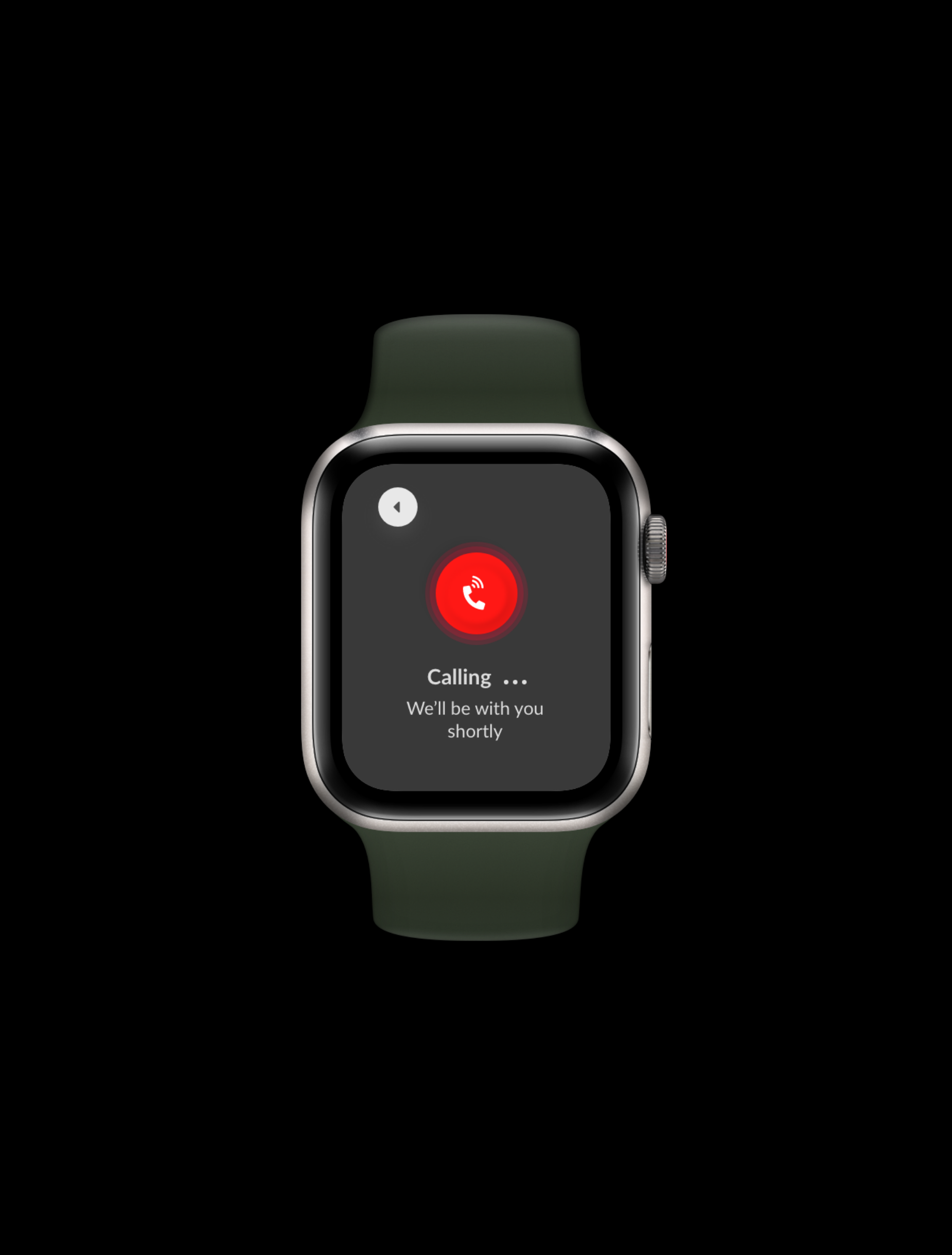
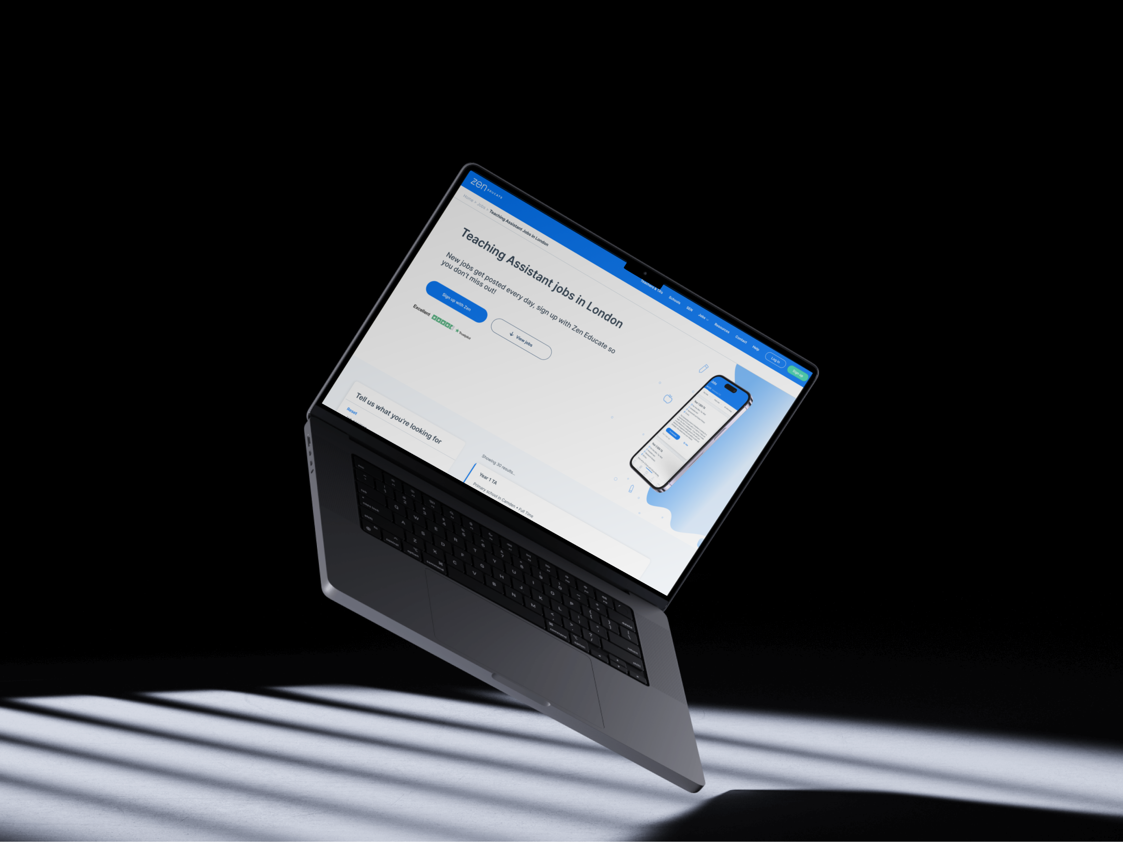
Zen Locum is an online platform that directly connects locums to stores in their area, making it quicker, easier, and cheaper for stores to find supply work.

Zen Locum is an online platform that directly connects locums to stores in their area, making it quicker, easier, and cheaper for stores to find supply work.
After being promoted to lead designer of Zen Locum, I embarked on the journey of learning a new product with a new customer base of over 8,000 active users.
As the only in-house UX designer I was on my own, working on a 2 year old product that had no style guide or brand guidelines to follow (not to mention a light mode and dark mode for both web and native applications. No design files, no design team, not even a clear job description. I got started in building a UI kit right away with the aim of strengthening consistency between design and engineering.
In order to get an overview of all the use cases we need to cater to, it is important to audit existing components in our product. We used Brad Frost’s interface inventory guideline as inspiration as we conducted a 2-hour audit within the team. We were each assigned areas of the web application to go through and make note of any design inconsistencies we noticed. At the end of the workshop we would each share our findings with the team.
As a result of this exercise, we identified a lot of inconsistencies in our design assets, which only proved the need for a more systematic approach to documenting, communicating, and maintaining our design system.
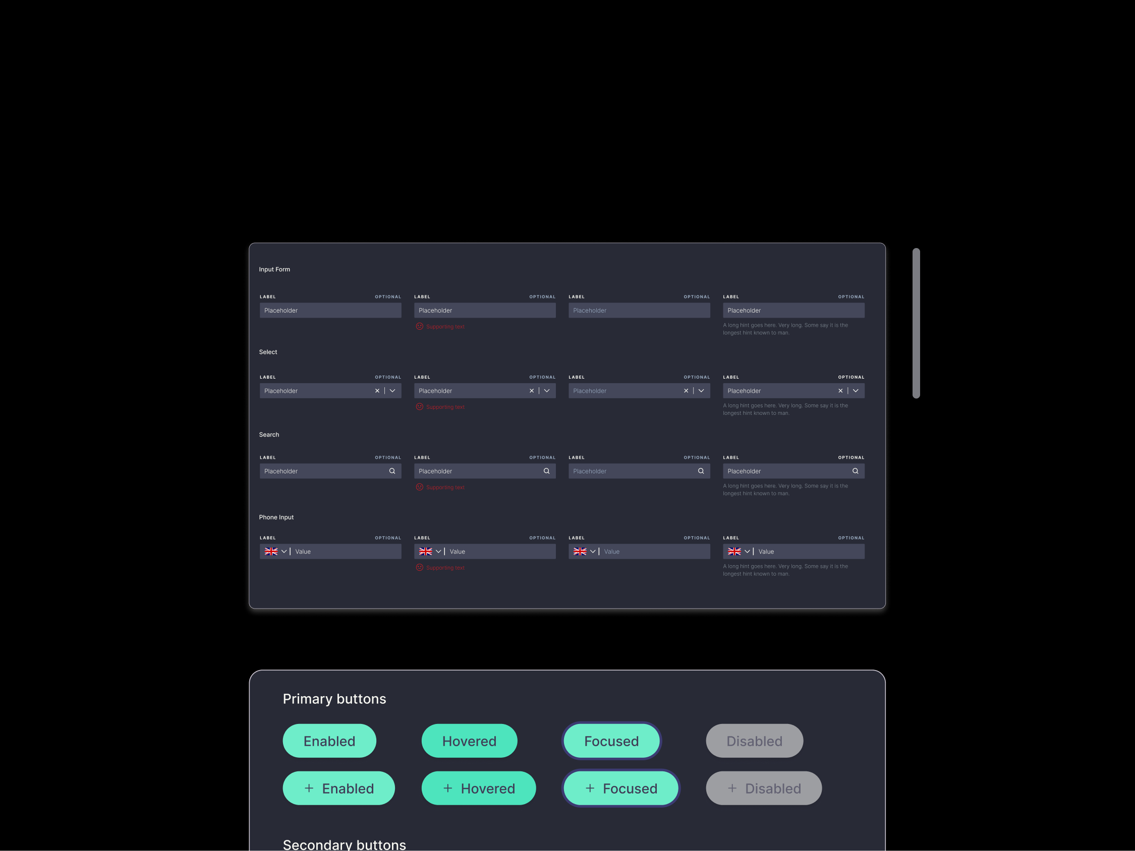
Below are some examples of the components screenshots we came up with after this exercise:
From this exercise, we felt it most useful to start with web components first as our desktop application was most frequently used yet accompanied with a cluttered codebase.

We decided to focus first on the foundational elements (atoms) of our design system, such as colour palettes, fonts, grid, spacing, buttons, etc., and then move on to more complex components over time. We created components on Figma, taking dimension inspirations from existing components in the codebase.
Some of the activities at this stage involved:

Once the foundational elements of our design system were established, I started plotting out the most frequently-used components of both our light and dark mode for web.
Some principles we followed:
When the Variants feature was introduced to Figma, we started using it to combine variants into component sets with custom properties and values. Using variants makes components easier to maintain, browse and swap through the sidebar menu.
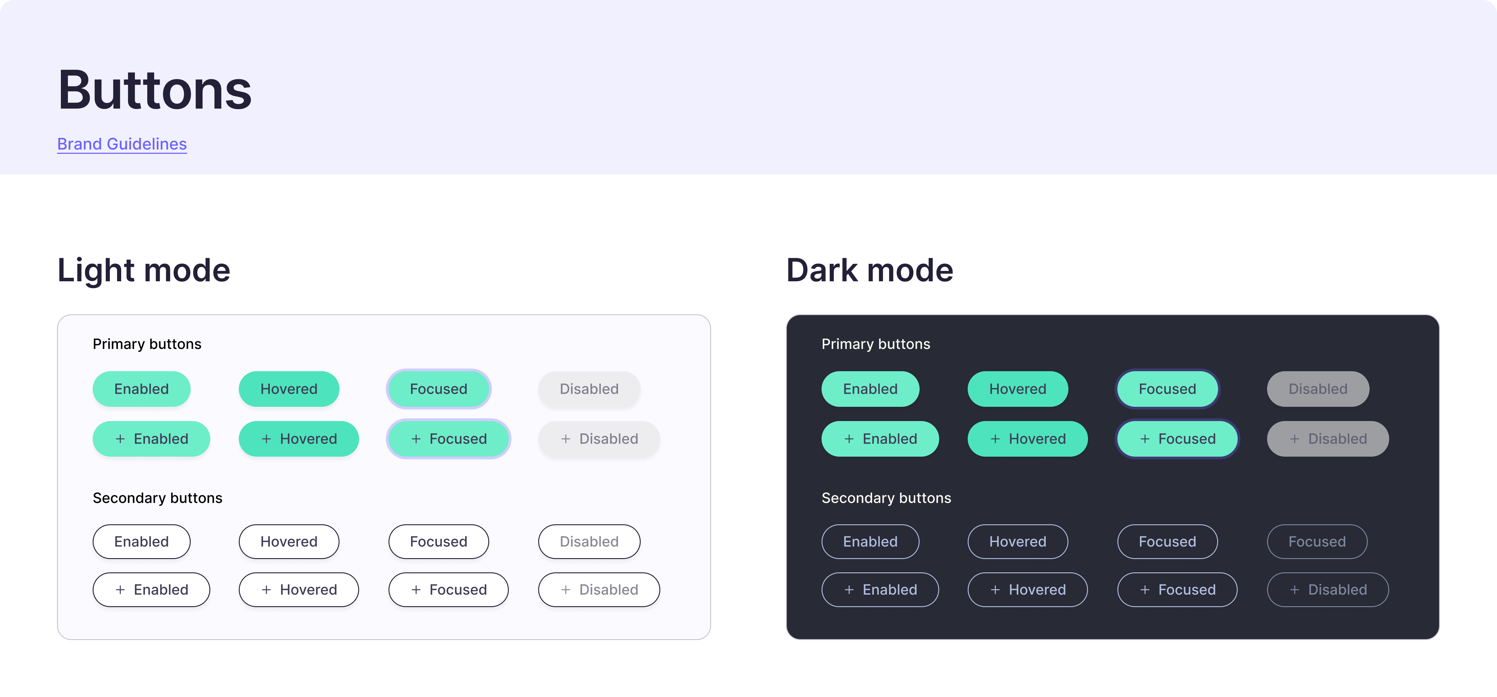
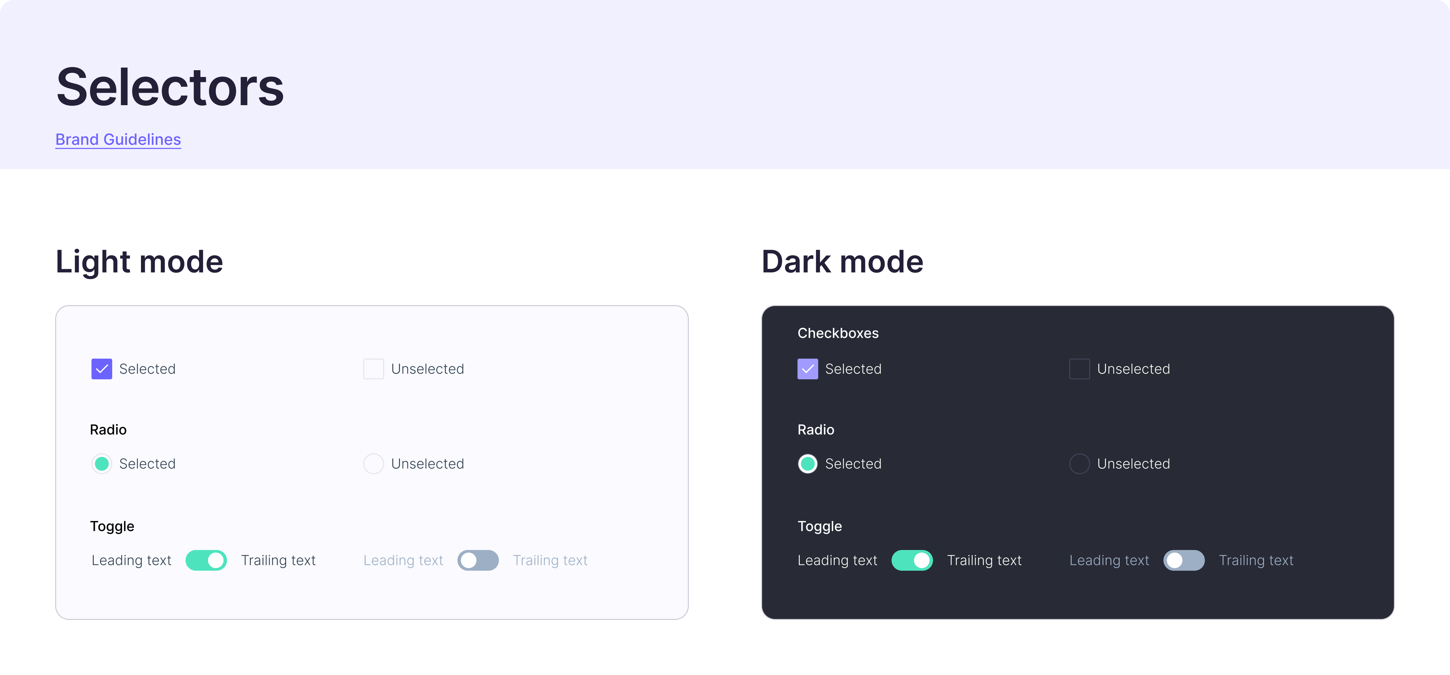
With this project, we strived to create a robust design system that was adapted for a scaling product and a growing team. With this, comes necessary documentation and integration software to ensure our design system stays up-to-date with the codebase.
We used Zeroheight, a platform that integrates with Figma and allows product teams to create and maintain web-based design system documentation. This allowed all components created in the Figma design system to have an in-depth written documentation attached to it, (including best practices, guidelines, breakpoints, and accessibility guidelines).
Our talented development team then set up a component repository using Storybook, a tool that allows to create an interactive pattern library for code in isolation and supports all the popular frontend frameworks. This allows any changes made in Zeroheight, or Figma to reflect in Storybook for these components to be easily kept up-to-date and re-used.
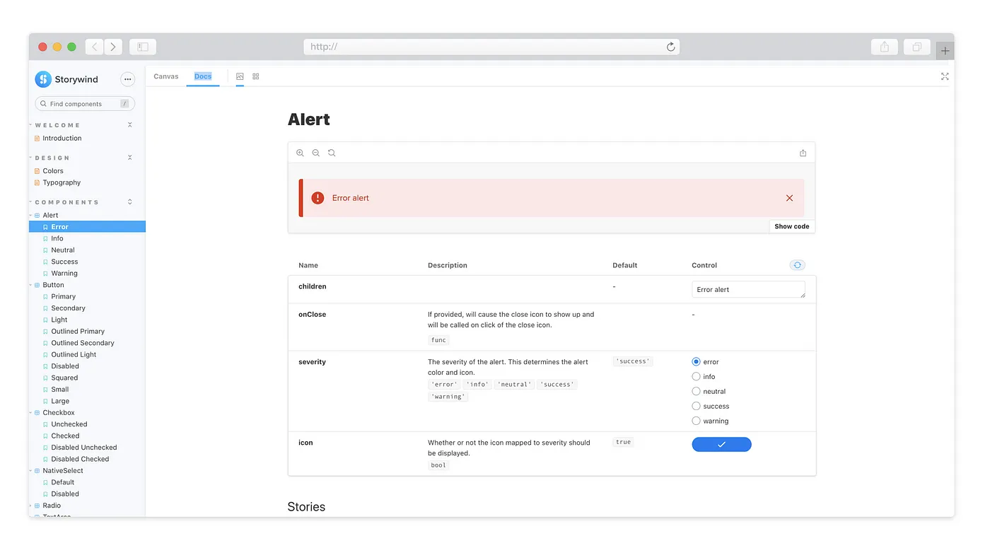
The design system is an ongoing project. We iterate, change and learn a lot in the process. So far, we have a set of basic components ready, which has been game-changing for our team in terms of efficiency, as well as consistency, and standardisation.
Some of our team’s next steps include: