Maintaining Professional Connection - A Design Sprint
Maintaining meaningful connections can be tough, making these connections can be even tougher. With online networking being the new norm, the personal bond built from face-to-face interaction is being lost. What if we could find a way to bring the unique connection of physical networking into the digital space, to make networking more personal, painless, and accessible?
Client
Makerspace Challenge - Imperial College London
Category
UX/UI Design, Branding, 3D Modeling
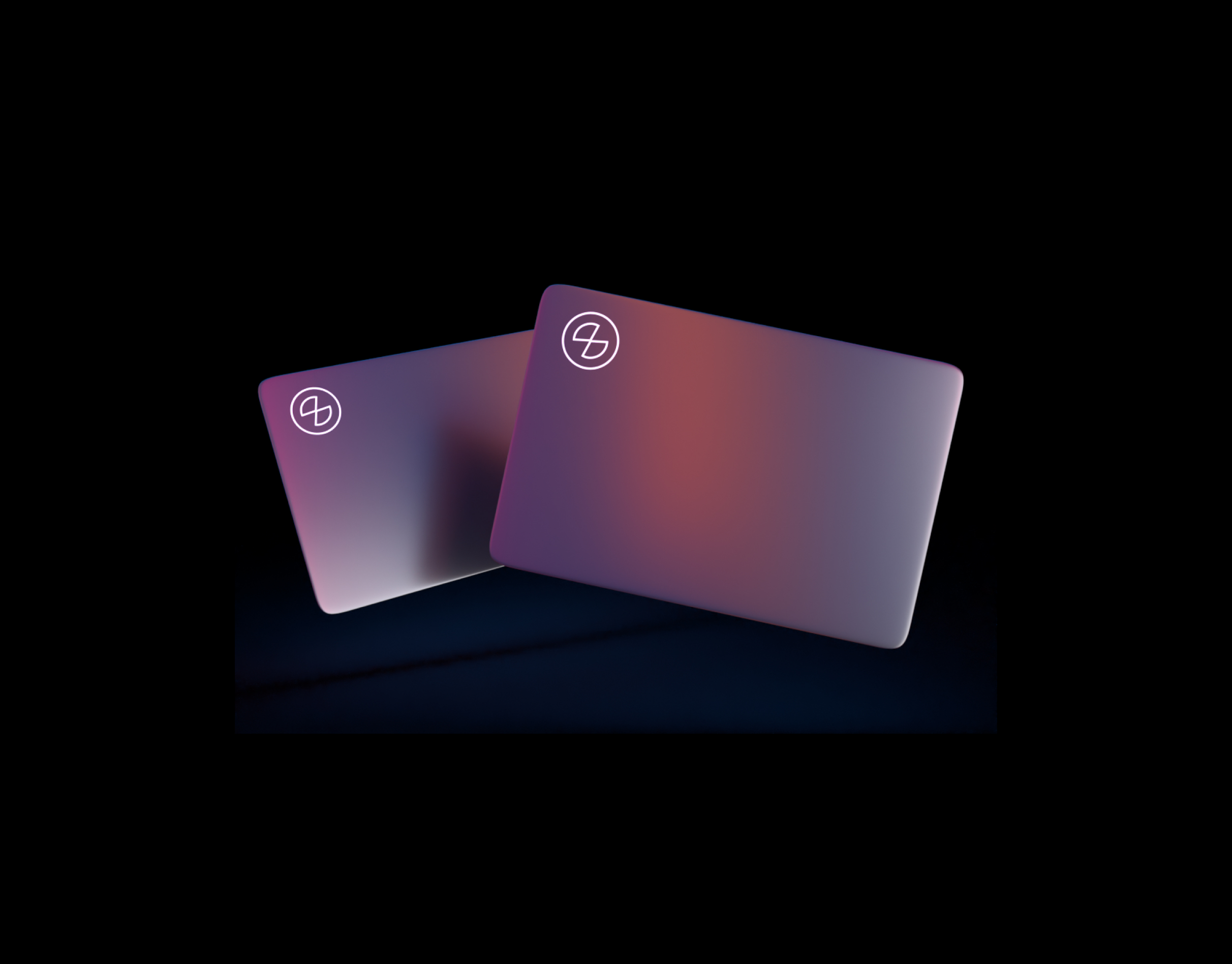
Connect is a social media app that provides digital business cards to career professionals to promote in-person networking, whilst keeping track of connections through a mobile application. The company aims to personalise the networking experience to create long-lasting impressions and foster stronger professional relationships.
In this UI/UX case study, we will delve into the design process for the creation of a new networking app and marketing landing page.
We will measure effectiveness by analysing how many connections our users make. A high number of connections means that our users are prioritising our app above the competitors for expanding their network and staying-in-touch with other professionals.
This project was completed as an 2 day design sprint as part of the Makerspace Challenge with Imperial College London alongside Luca Tajaña-Rodriguez, a talented Webflow developer and translator.
Goal
The objective of this project is to create a user-centered and intuitive user experience for a networking app, that caters specifically to career enthusiasts and small business owners.
The company aims to bring together entrepreneurs with shared experiences to learn from each other within a supportive community for mutual benefit.
Let's Get Started...
What problem are we facing?
Where we started...
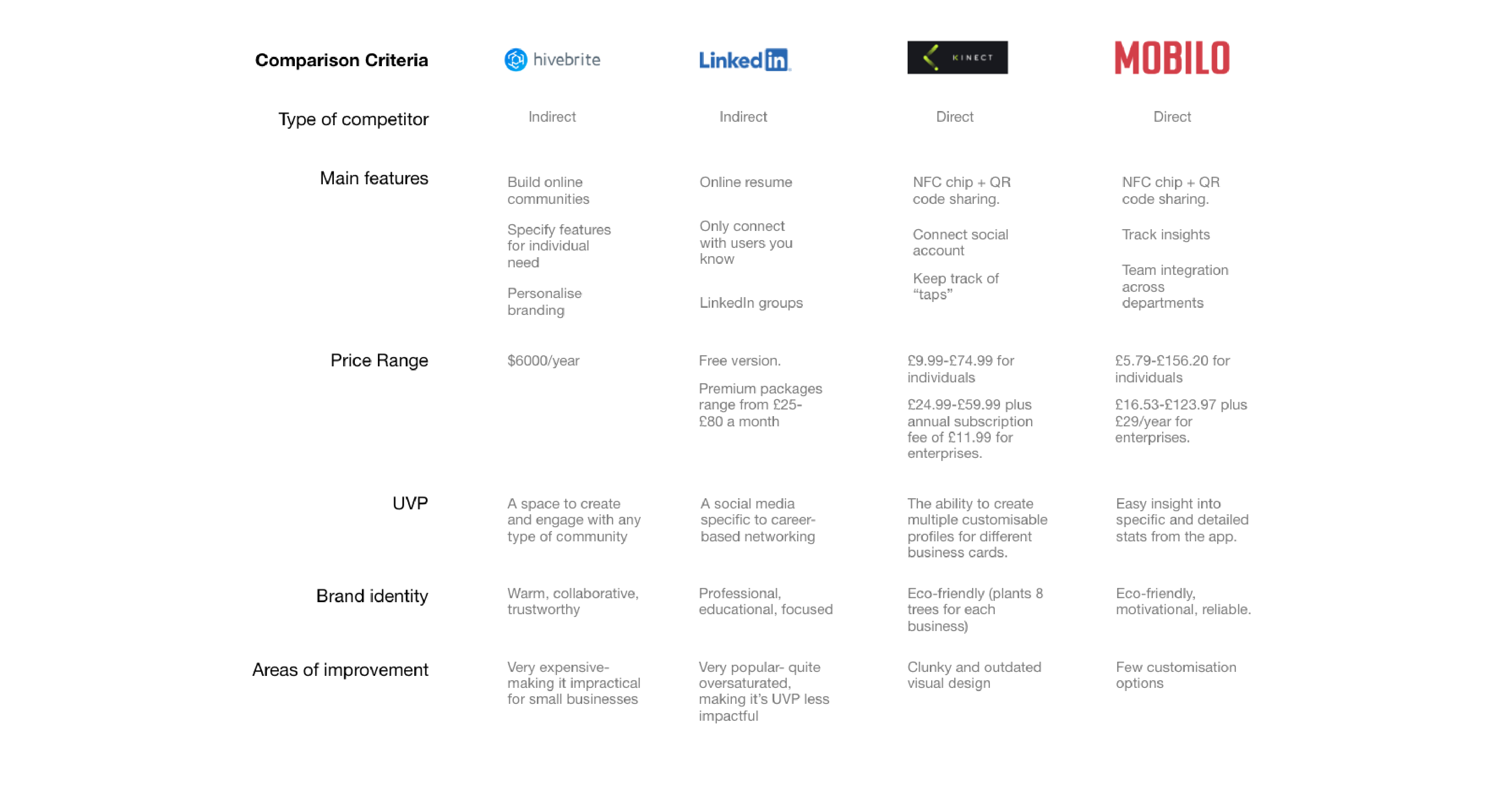
Starting with a whiteboard brainstorming session, we began a comparative analysis on existing products to work out gaps in the market and areas of improvement.
User Interviews
We conducted 3 in-person interviews with local small-business owners, as well as observed online forums for career starters trying to break into the job market, with the aim of understanding their needs and frustrations. Through a synthesis, I was able to better define their needs and extract major pain points for people trying to grow their network.
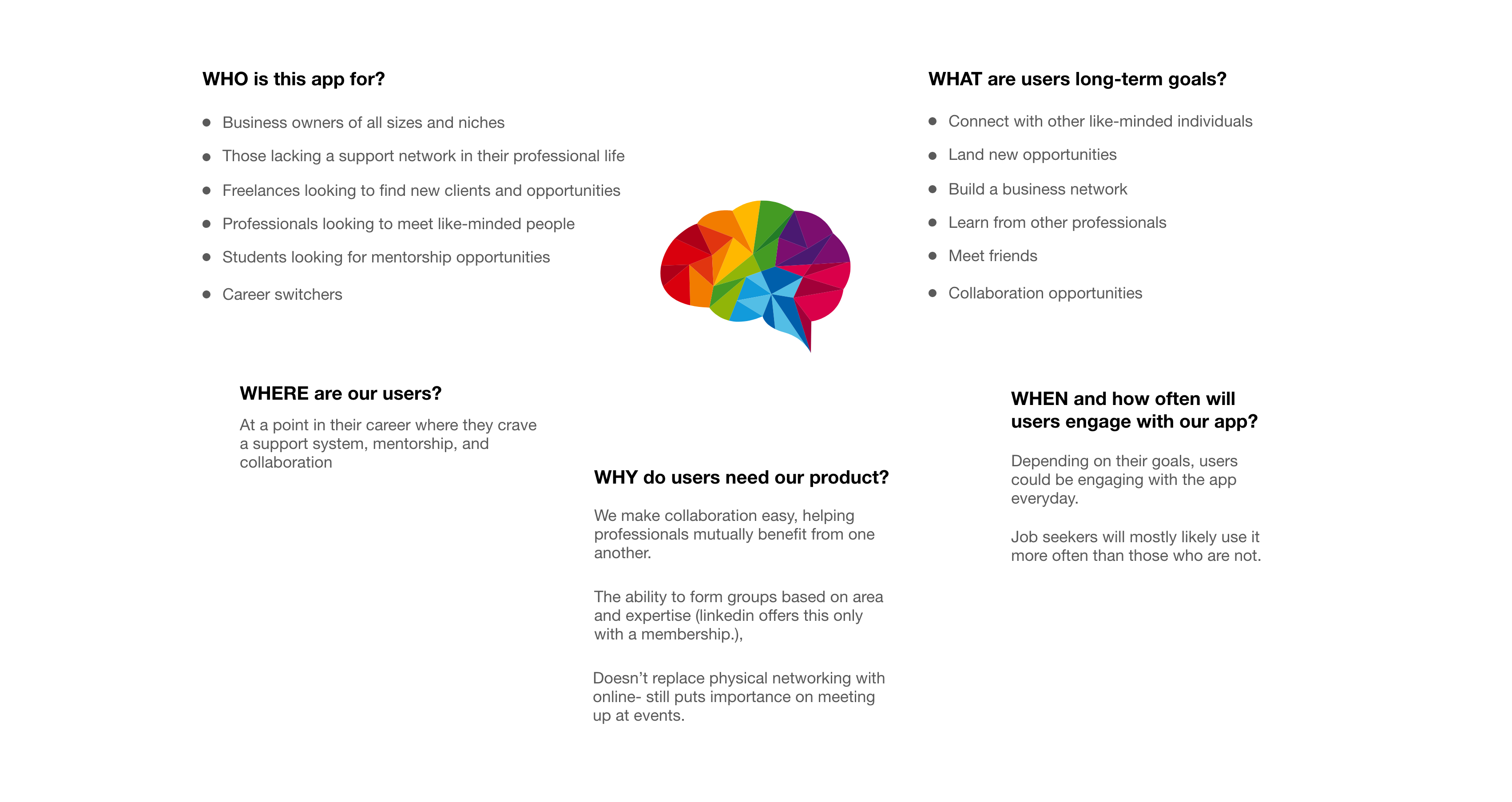
Target Market and Users
User: Professionals looking for career development, networking and opportunities. They are familiar with LinkedIn and other social networking apps.
Market: People who attends job fair, conventions and other professional social networks.
Zeroing into:
Long-term connections- Physical business cards are a thing of the past, and existing competitors are focused on digitalising the networking experience, taking away the meaningful connection of an in-person meeting. Finding a way to breed the physical meeting with a digital experience will help foster more long-term, sincere relationships.
Educational resources: Provide informative and accessible content regarding successful networking, and professional advices, will attract career starters and switchers.
Personalised financial insights: Develop a dashboard or feature that offers personalised card insights and tips based on the user’s behaviour.
User-friendly mobile experience: Ensure the in-app experience is fully optimised for mobile devices, as the target audience heavily relies on smartphones for their day-to-day activities.
Defining the problem...
What do our users need?
Approaching The Problem
Starting by plotting out the customer journey map derives from speaking to our users, you can clearly see when the user experience starts to dwindle.
Obtaining quantitative metrics
Wedecided to conduct a closed-card experiment before jumping into the design phase. The aim of this research method was to try and understand what words users naturally associate together to try and make a structure which is intuitive for users.
Findings
The findings from the card sort show that the most commonly associated words with network were “business” and “opportunity”. With this in mind, it would make sense that that app reflects these findings by putting emphasis into establishing a hub for business networks to thrive and find opportunities. A feature which may align with this is establishing forums and clubs that users can join to connect with other like minded individuals, as well as find opportunities they may be interested in.Another interesting finding was tha “profile” was most commonly associated with personal updates, friends, and growth. Using these insights, adding an area to keep up-to-date with friends and read their updates will help form more personal connections and lead to growth over time.
Summarising our goals
Our digital business card app will let users easily share and connect with other professionals to help broaden their network.
This will affect how professionals make connections, by giving them the incentive to physically meet with one another so that they can access groups. This will foster a focused and postive business network, as well as encourage users to maintain long-term connections.
We will measure effectiveness by analysing how many connections our users make. A high number of connections means that our users are prioritising our app above the competitors for expanding their network and staying-in-touch with other professionals.
Building the designs...
Bringing our ideas to life
Building The Design System
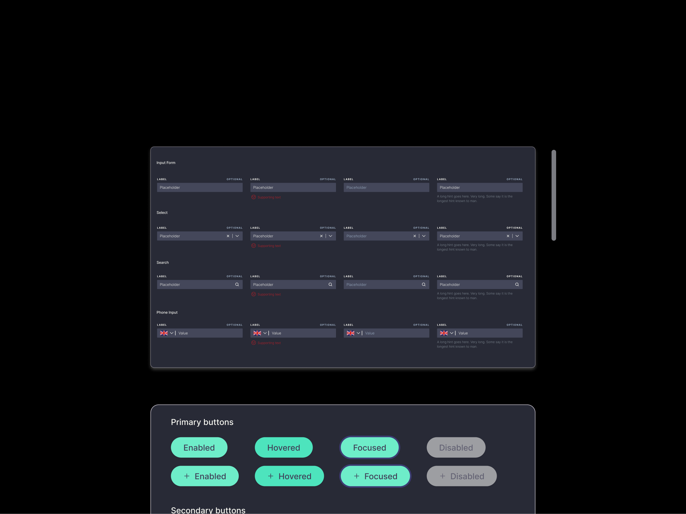
Whilst testing the app navigation, I started building up the design system from an existing landing page and product images. The purpose of building a compact design system for this project was so I could rapidly create high-fidelity prototypes for stakeholder presentations as well as testing purposes to acquire more realistic data.
Testing our hypothesis...
Are we moving in the right direction?
Testing Low-Fidelity Wireframes
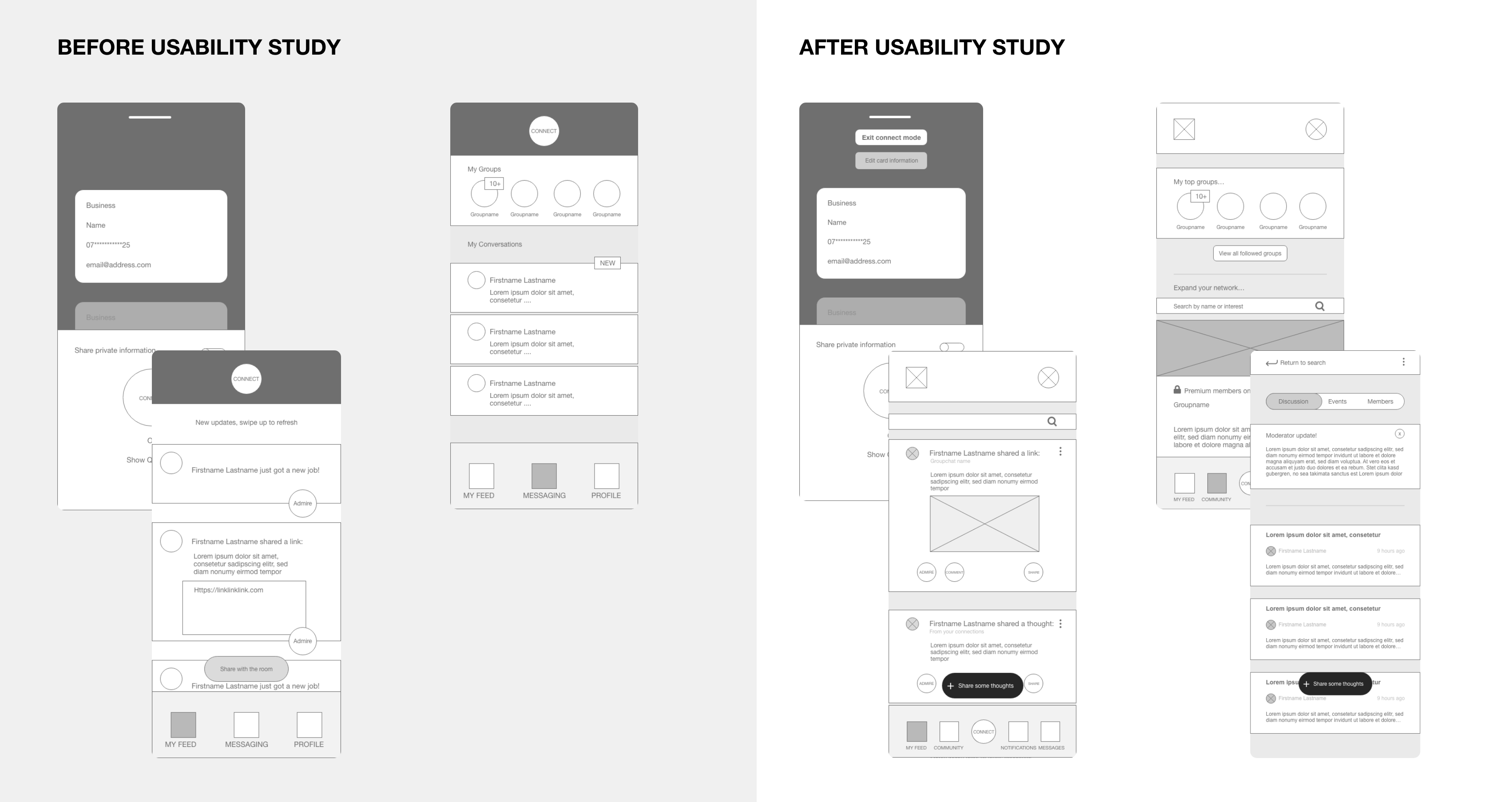
The findings from our card sort gave me a general idea of what users may be interested in for this product. After deriving some low fidelity wireframes, I decided to carry out one round of testing, with the hopes of uncovering users’ current pain points relating to the layout and information architecture of the app.
The Results
80% of participants mentioned the “connect” button felt out of place.
“I feel like it takes up too much space.”
“I think it’s a bit too big”
“I thought that was the logo”
The "connect" button allows two users to add each other as friends when in the same proximity, however participants stated that this interaction takes up too much space and wasn't obvious what the button did.
Therefore, we decided to add the connect button to the bottom navigation to free up more space in the header, as well as separate out the in-app messaging feature and community groups to different pages of the navigation as that also caused concern during the usability study.
Other participants also showed interest in other features which they explained would be vitally important for the V1:
“I’d like to be able to comment on posts so I can ask questions about opportunities or start a conversation like you can do on Linkedin.”
“I couldn’t even see the button to share a post myself, maybe it could stand out a bit more.”
“I can’t figure out how to return [to the home screen from the connect page]”
In conclusion...
What we achieved, challenges, and next steps
Final designs
Starting by sketching up the changes of the general layout of the app after testing, I can map out concepts, plot points, or storylines. This helps me see the whole picture and make connections between different parts of my project.
High-Fidelity Mockups
Conclusions
Our users can now successfully network to their preferences, using a physical card or their Connect app.
They can now make automatic connections by turning on "Proximity connect", allowing all users with the Connect app in a certain proximity to connect with one another. - allowing contact information to be shared without worrying about pulling out their phone mid-conversation.
Future Possibilities
There are more features can be added along with the growth and development of the app.
QR code for direct contact info exchanging
Smart reminder — eg.: “ You haven’t talk with this person for a long time, how about grab a coffee with him?”
Actions: coffee, hang out
Timeline with connections
Map in timeline to hint the place you met
Takeaways
Communicate effectively with clients, and try to follow the business plan provided.
Be aware of tech restraints before starting the design.
Test early, test often, test always.
Research drives the design. All the ideation and solution should come from research.
Process is all it matters.
More work
Building A Design System: Aligning Design And Engineering